Appendix 1
Additional graphs and tables
Table 1.A1.1: Allocation of sectors to groups based on energy intensity

Note
Luxembourg is excluded due to a lack of data.
Source
Own calculations based on Eurostat [env_ac_pefa04, nama_10_a64]
Graph 1.A1.1: Employment in the EU by energy intensity (fourth quarter of 2019 = 100)
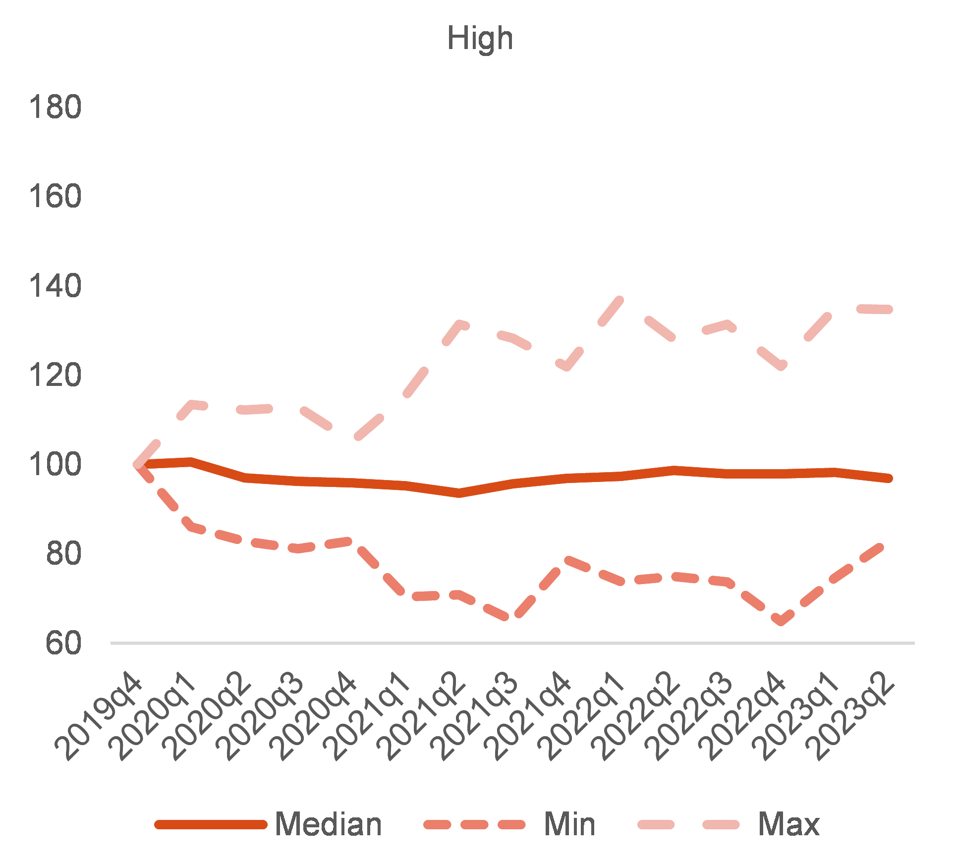


Additional information about graph 1.A1.1
The chart has four panels. Each panel shows the minimum the maximum and the median employment level relative to 2019Q4 for the low, mid-low, mid-high and high energy intensive sectors. Energy intensity is measured as Tera Jule per value added. The different groups are defined based on the quartile of the sectoral distribution of energy intensity. The chart shows that employment has been growing in the low and mid-low groups while it stagnated in the high and mid-high. Yet some industries in the high energy intensive groups created employment throughout the period, while the opposite occurred in some low energy intensive industries.
Note
Each chart shows the minimum, the maximum and the median employment levels relative to the fourth quarter of 2019. Energy intensity is measured as terajoules per value added. The groups were defined based on quartiles of sectoral distribution of energy intensity. The quartiles measure the spread of values above and below the mean by dividing the distribution into four groups. Seasonally adjusted data.
Source
Eurostat [lfsq_egan22d, lfsq_egan2, env_ac_pefa04, nama_10_a64].
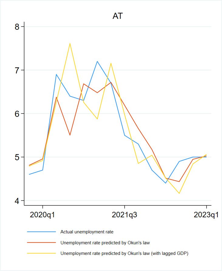
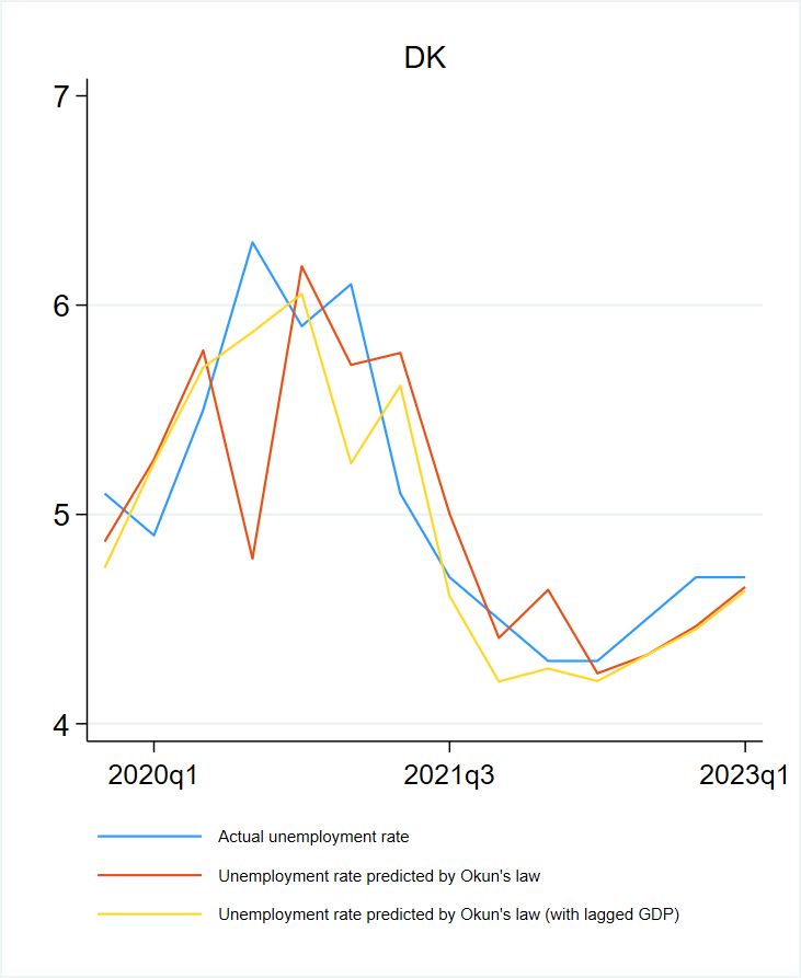
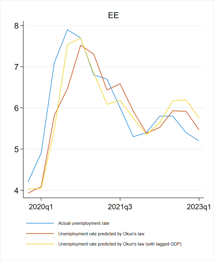
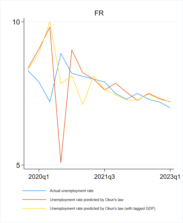
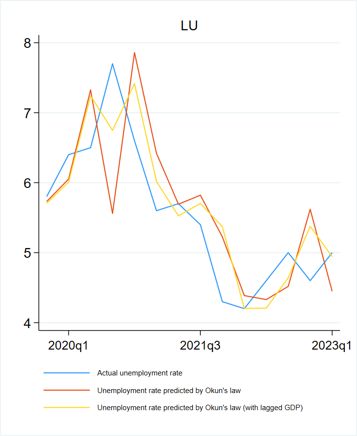
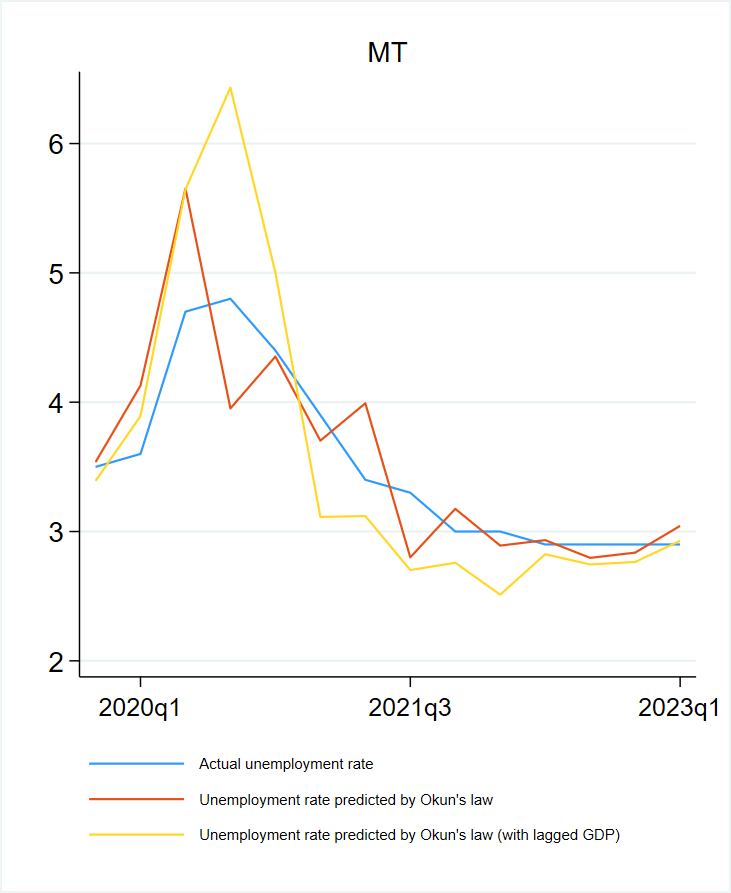
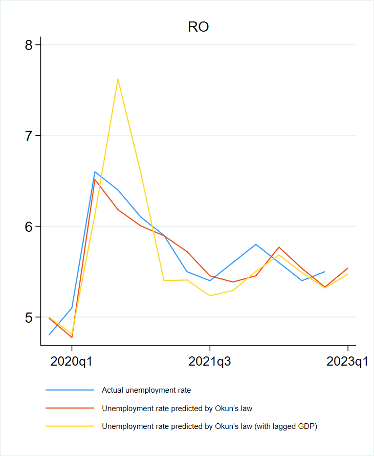
Graph 1.A1.2: Actual and predicted unemployment rate in each Member State


Additional information about graph 1.A1.2
The chart shows for each Member States the actual unemployment rate and the unemployment rate predicted by current and lagged GDP growth. In both cases the predicted unemployment rate tracks quite well the evolution of the actual unemployment.
Note
Estimation based on Okun’s law with current and two lags of GDP growth. Panel estimate for all EU Member States, first quarter of 2000 to fourth quarter of 2019.
Source
Eurostat [namq_10_gdp, une_rt_q, une_rt_q_h].
Graph 1.A1.3: New job postings, Germany, Ireland and France, 2020-2023

Additional information about graph 1.A1.3
The chart shows the new job postings published in Indeed.com for 7 days or fewer. After an increase that lasted until early 2023, the new job postings started to decline (more in Germany and Ireland than in France) hinting at the economic slowdown started to have an effect on the labour market.
Note
M, month. New job postings refer to jobs posted on Indeed.com for 7 days or fewer. Monthly data used for 2020-2022, and daily data used for 2023.
Source
Indeed Hiring Lab.
Appendix 2
The Beveridge curve: a primer
The Beveridge curve depicts the relation between vacancies and unemployment.This relationship has been interpreted as the outcome of the job search and matching process, when the job flows into and out of unemployment are balanced. It is derived from two main relationships. The first describes the relation between the change in unemployment and the flows into and out of unemployment. It is easy to show that, when the two flows are equal, unemployment is unchanged and is equal to the ratio between the job destruction rate and the sum of the probabilities of finding (f) and losing a job (s). In symbols, this is presented as follows:
The second relation links the vacancy-to-unemployment ratio (labour market tightness) with the job finding probability via the matching function. The standard form for this function is the Cobb-Douglas:
Where μ is an indication of the ease of forming job matches (matching efficiency) and represents how () varies in response to a change in labour market tightness . This expression implies that it is relatively easy to find a job when the labour market is tight. Substituting the second equation into the first gives the Beveridge curve: the relation between unemployment and vacancies when the unemployment rate does not change (i.e. the labour market is in a steady state).
Over the business cycle, unemployment and vacancies move along a downward-sloping non-linear curve.An increase in labour market tightness increases the probability of finding a job and the corresponding outflows from unemployment, thereby reducing the level of unemployment consistently with the balance between inflows and outflows. A decrease in labour market tightness does the opposite. Moreover, when the labour market is tight, it is more difficult for employers to fill vacancies due to the relatively low number of job seekers; thus, any increase in the number of job vacancies relative to unemployment increases the job-finding probability by less than when the labour market is weak. Similarly, the decrease in job-finding probability is also less when the number of vacancies decreases. This non-linearity between the job-finding probability and labour market tightness generates the non-linear relation between vacancies and the unemployment rate. If the Beveridge curve does not shift, a decline in labour demand when the labour market is tight is accompanied by a drop in vacancies larger than the increase in unemployment.
The Beveridge curve may shift if there are changes in the quality of the job-matching process or in the probability of losing a job.Matching efficiency worsens when, for example, a reallocation shock creates a mismatch between the characteristics of the job seekers and the type of skills demanded by firms. In this case, a drop in matching efficiency lowers the probability of finding a job, implying that a higher number of vacancies is necessary to maintain a given flow out of unemployment: and so, the Beveridge curve shifts upward. The symmetric argument holds when skills mismatches decline and matching efficiency improves. The Beveridge curve also shifts when the probability of losing a job increases, as, for the unemployment rate to stay unchanged, an increase in the probability of finding a job is required. In both cases, a higher number of vacancies is needed to keep the unemployment rate stable (i.e. in a steady state) – hence the Beveridge curve shifts up. The difference between a less efficient matching process and a higher probability of losing a job is important when attempting to lower unemployment. The former affects the employment prospects of unemployed people (through their probability of finding a job), while the latter affects the stability of the employment status of incumbent workers (i.e. the duration of existing job matches).
The actual number of vacancies and the unemployment rate can also reflect the dynamics of the labour market when it is not in a steady state.This happens when inflows and outflows are not balanced; such a dynamic is characterised by counterclockwise loops created by the different rate at which vacancies (which are hiring intentions) and unemployment (which reflects effective decisions) respond over the business cycle (Blanchard and Diamond 1989). If temporary, these changes do not affect either the position or the slope of the steady-state Beveridge curve.
The ‘empirical’ Beveridge curve has a pattern that is consistent with the theoretical framework explained above.At the onset of the 2007-2008 financial crisis, the drop in labour demand was accompanied by an increase in unemployment and a decline in job vacancies – a movement along the Beveridge curve that was typical of a slowdown. During the recovery period (the first quarter of 2010 and the third quarter of 2011), job vacancies grew without any decline in unemployment – a change interpreted as attributable to a deterioration in matching efficiency due to rising skills mismatches. From 2013, the unemployment rate started to decline, but with only a small increase in job vacancies, consistent with a flat Beveridge curve. As the unemployment rate approached very low levels, vacancies and unemployment moved along a steeper curve. Finally, during the pandemic recession, unemployment and vacancies moved counter-clockwise, with vacancies dropping faster than the increase in unemployment – a pattern due largely to the use of short-time work schemes (which limited job destruction and kept the probability of losing a job low). In the subsequent recovery, vacancies reached an all-time high, with unemployment declining along a steep curve. Unlike the shift seen in 2010-2011, the pandemic recession shifted the Beveridge curve only temporarily (Turrini et al., 2022).
The steady-state Beveridge curve is constructed by estimating the parameters of its two underlying equations illustrated above. The job-finding rate () is computed as the difference between the short-term unemployment (i.e., the number of people who have been unemployed for less than 3 months) in a given quarter and the change in total unemployment, expressed as a percentage of total unemployment in the previous quarter (Elsby et al., 2013; Shimer, 2012). The elasticity of the matching efficiency () is estimated using a regression of f on the labour market tightness (in logs). The estimated coefficient for the EU over the period between the first quarter of 2005 and the fourth quarter of 2019 is 0.22. The matching efficiency (μ) can be obtained as the residual of the regression of f on labour market tightness . Finally, given an estimate of f, the separation rate (s) can be obtained, as done by Shimer (2012), to account for the possibility of transitions between employment and unemployment between two consecutive surveys.
Graph 1.A2.1 provides an overview of the shifts in matching efficiency.Estimates of matching efficiency were very high at the beginning of the pandemic, partly reflecting the outward shift in the curve caused by a drop in the job-search intensity and recruitment intensity. Less noticed is that, after the volatility of the pandemic recession, the efficiency of the matching process remained high. To some extent, this may reflect the recruitment efforts of firms in the context of a tight labour market. Yet matching efficiency remained high when its estimation incorporated the effect of recruitment intensity .
Graph 1.A2.1: Estimates for the matching efficiency for the EU

Additional information about graph 1.A2.1
The charts show two lines displaying estimates of the matching efficiency obtained from a standard and a generalised matching function. Both lines hint at a decline in the matching efficiency between 2010Q1 and 2012Q1, followed by a recovery until the onset of the pandemic. Except for a temporary decline observed at the end of 2020, improvements in the matching efficiency continued until the end of 2021. In 2022, matching efficiency declined in response to the decline in economic activity.
Note
(1) Davis et al (2013) estimate the elasticity of the job filling rate to the gross hiring rate at the establishment level at 0.82. The recruitment intensity is computed applying this coefficient to the hiring rate of those with duration of less than three months.
From the steady-state Beveridge curve it is possible to disentangle the effect of cyclical fluctuations from the effect of structural shifts.Graph 1.A2.2 shows the steady-state Beveridge curve for different values of the separation rate (s), holding the matching efficiency () and its elasticity () constant at their values estimated over the pre-pandemic period. The different lines (s1 – s5), are drawn for different values of the separation rate (increasing, from left to right). The matching efficiency is assumed constant at the average value estimated over the period 2005Q1-2019Q4, except for the most rightward line, which shows the combined effect of a higher separation rate and a drop in matching efficiency equivalent to the decline recorded between 2010Q3 and 2011Q3. The graph reveals several interesting features.
- In a tight labour market, a fall in labour demand is accompanied by a smaller increase in unemployment.
- When the separation rate decreases (i.e. fewer people are fired), the Beveridge curve shifts leftward (e.g. from the curve ‘s4’ to the curve ‘s1’). Hence, for a given vacancy rate, the steady-state unemployment rate falls when the job destruction rate declines.
- For the values of the unemployment rate observed over the last 10 years, the Beveridge curve becomes flatter as the separation rate s declines. This implies that in equilibrium, when the job separation rate is low, a smaller increase in the vacancy rate is needed to obtain a given decline in the unemployment rate. The intuition is that it is easier for employers to fulfil an increase in their demand for labour if there are few dismissals.
Finally, this framework makes it possible to understand how unemployment would respond to changes in one of the underlying variables.Taking the tight labour market of the last quarter of 2022 as starting point, it is possible to simulate how unemployment would respond to a reduction in the vacancy rate (i.e. a decrease in the job-finding rate), an increase in the job dismissal rate and a decrease in matching efficiency.
Graph 1.A2.2: Actual and steady-state Beveridge curves for the EU

Additional information about graph 1.A2.2
The chart compares the actual Beveridge curve with different steady state Beveridge curves. These are obtained conditional to different values of the job separation rates. The chart shows that the most recent part of the actual curve is consistent with the average separation rate of the period 2005Q1-2019Q1 and that the lower is the separation rate the more the Beveridge curve is shifted to the left.
Note
the steady state Beveridge curves (s1-s5) are computed for different values of s and μ.